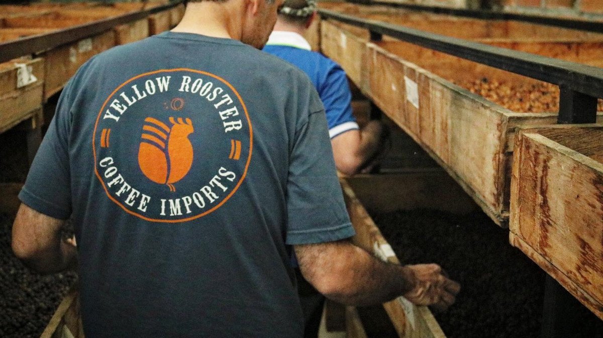
Yellow Rooster was a new specialty coffee importer in the US, with a clear instinct for relationships on both sides of the trade.
Ernesto
De Leonardi
I inhabit cultures. I build systems.
Brand Strategy · Cultural Research · Communications
Working across the US, New Zealand, Argentina and Australia taught me one thing: pay attention to what's not being said.
About
I turn what's felt
but unnamed
into form.
My formation is split between communication sciences, semiotics, and two years on the road in a Kombi through Latin America.
What I do
Cultural & Field Research
Cultural Brand Strategy & Positioning
Packaging & Content Strategy
Research-Led Creative Direction
Selected Work
01
Overview
The Challenge
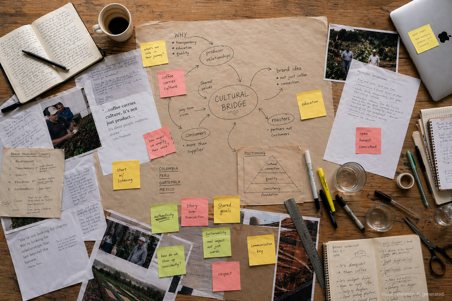
The energy was already there. Producers and roasters wanted to work with Yellow Rooster, came back, told others. Nobody had stopped to ask why, or to give it a form.
Approach
The starting point was listening. To the team, to coffee roasters, to the producers behind each origin.
Solution
If Yellow Rooster was a cultural bridge, every touchpoint had to feel like one.
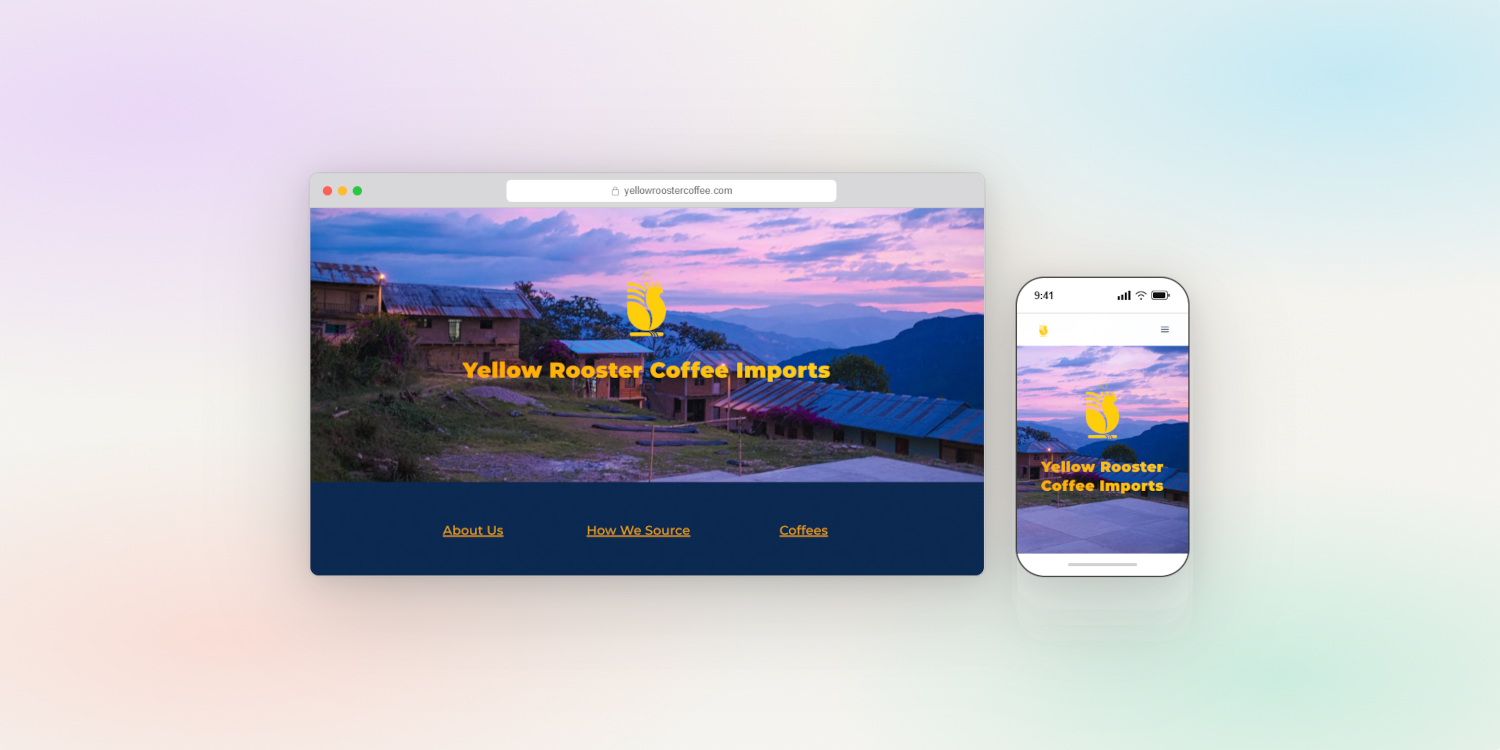
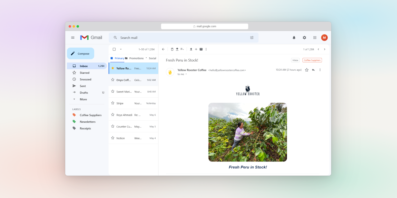
The team already had a voice on Instagram. The work was giving it a structure that could travel across email and the website.
Results
Coffee roasters who had always trusted Yellow Rooster now had a brand they could point to.
2022–2023 · Specialty Coffee · Brand Strategy, Cultural Positioning, Communications Architecture · USA
02
Overview
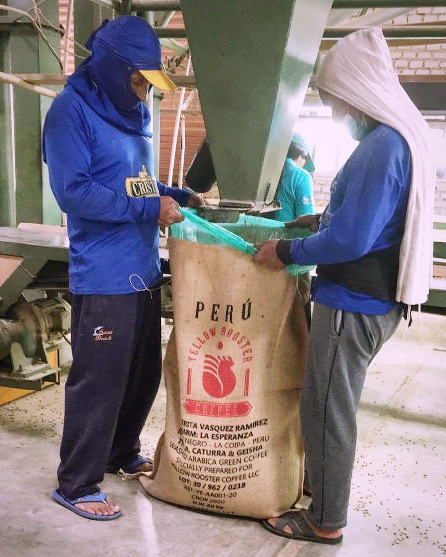
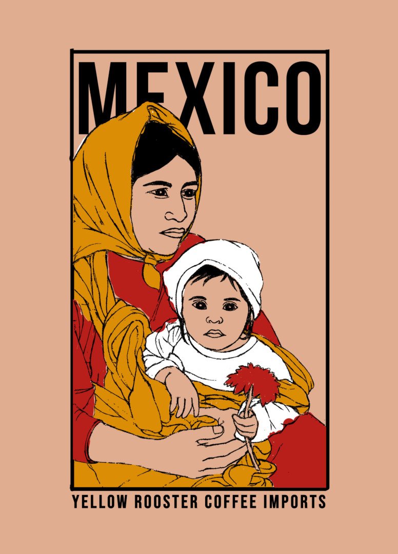
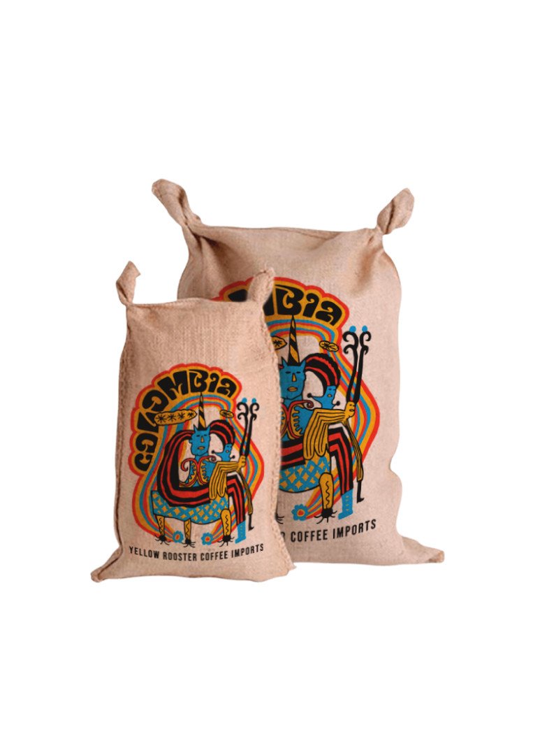
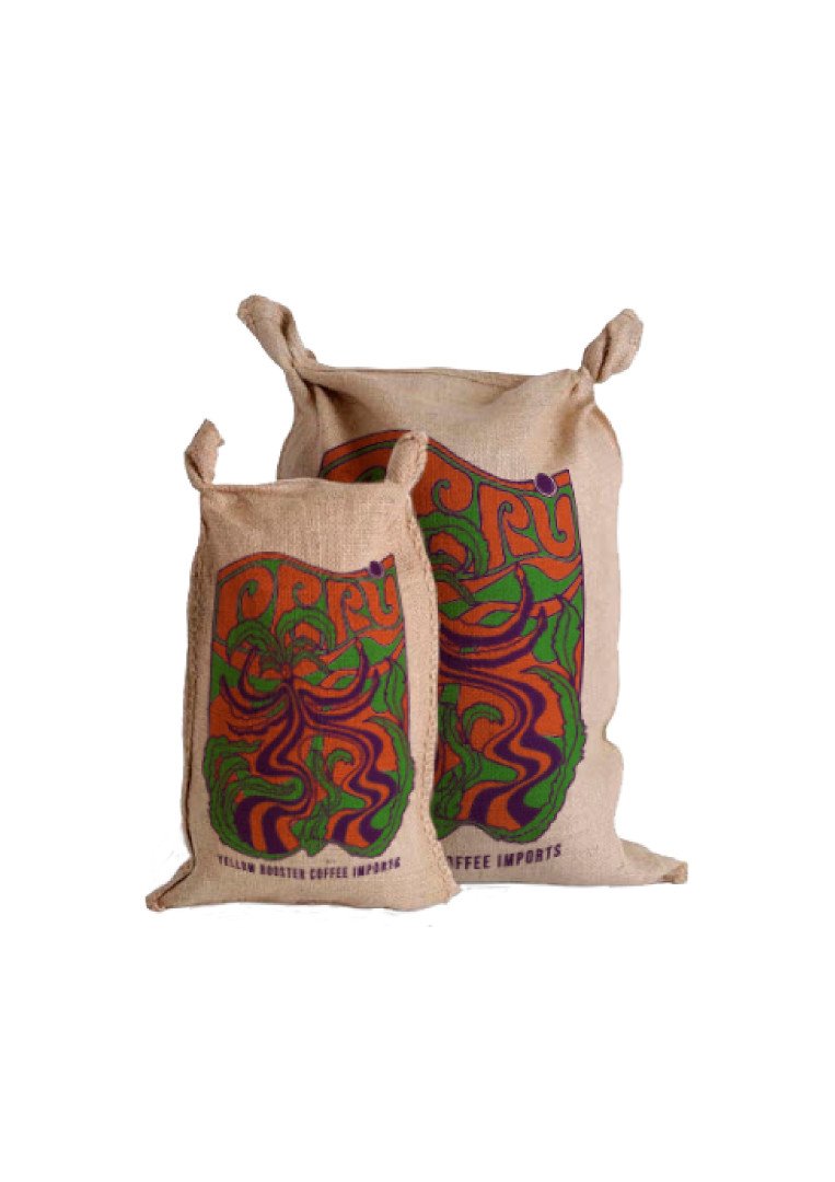
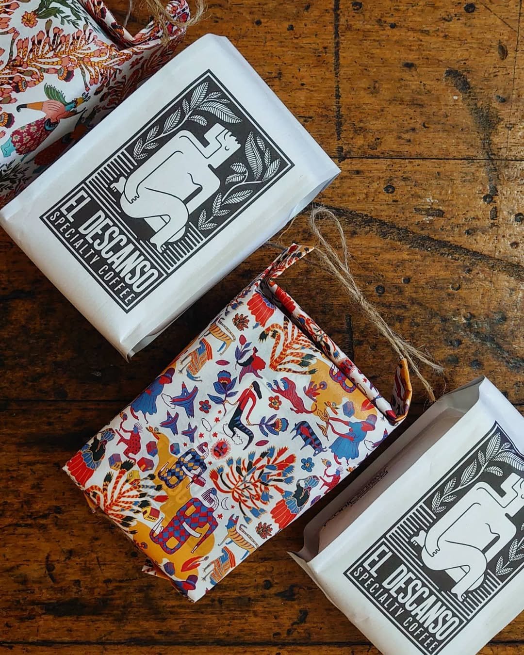
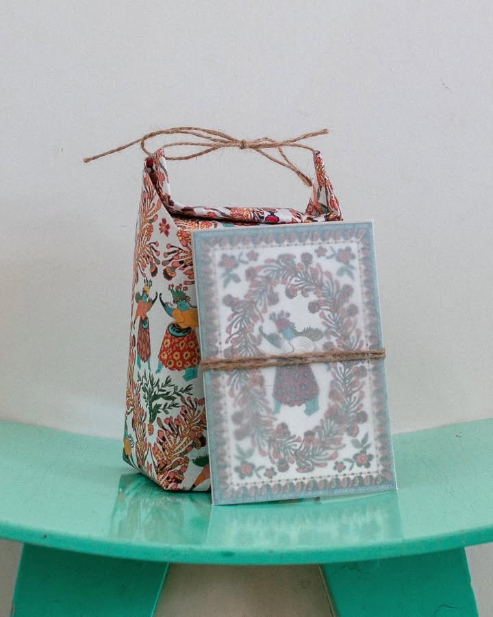
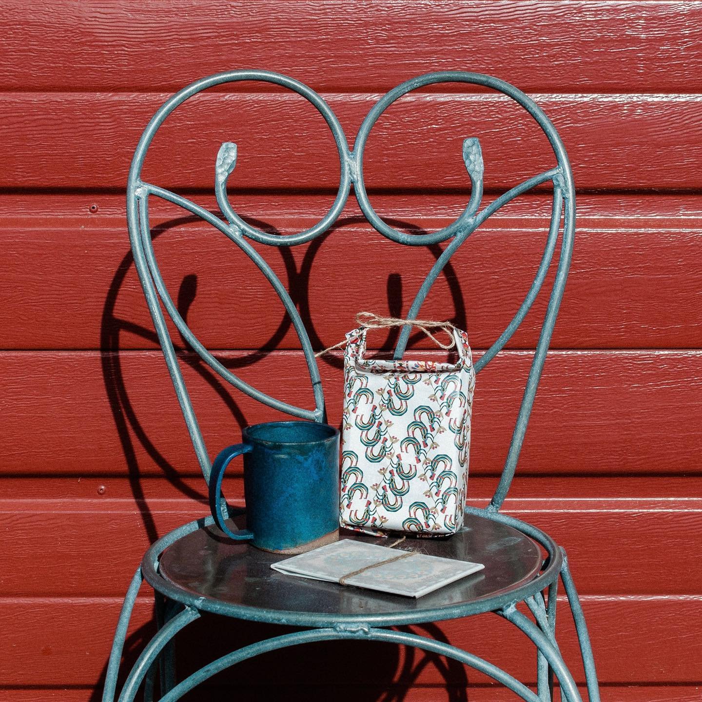
The generic bag that left Yellow Rooster's warehouse was a missed conversation.
The Challenge
Every coffee carries a culture. That was Yellow Rooster's core belief and the packaging contradicted it completely.
Approach
The starting point was a question: what does this place carry that the coffee alone can't communicate?
Solution
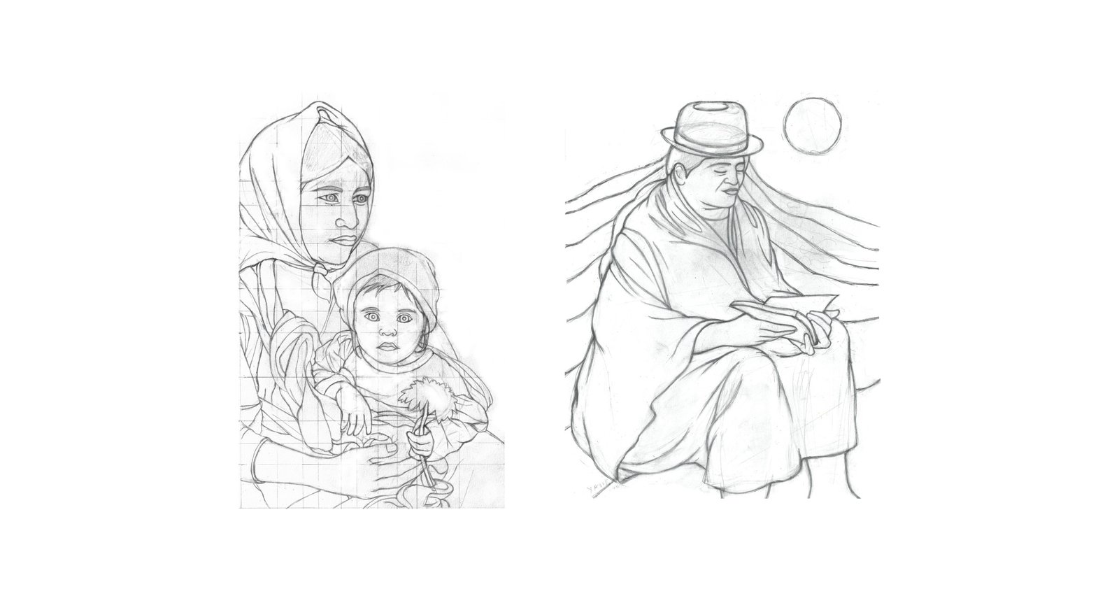
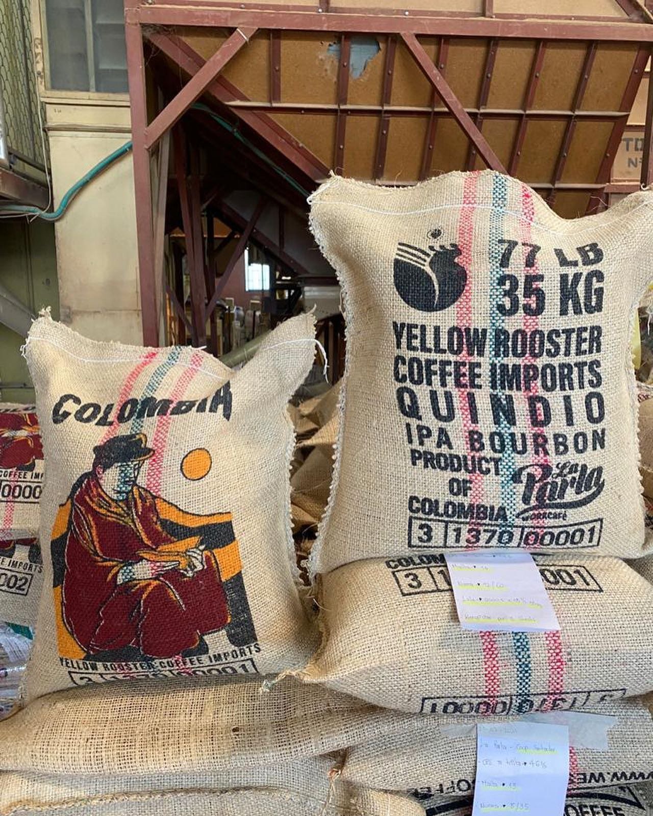
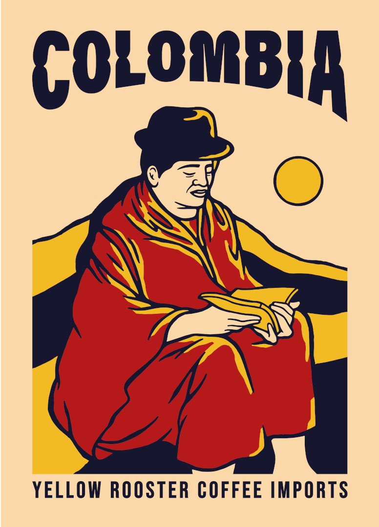
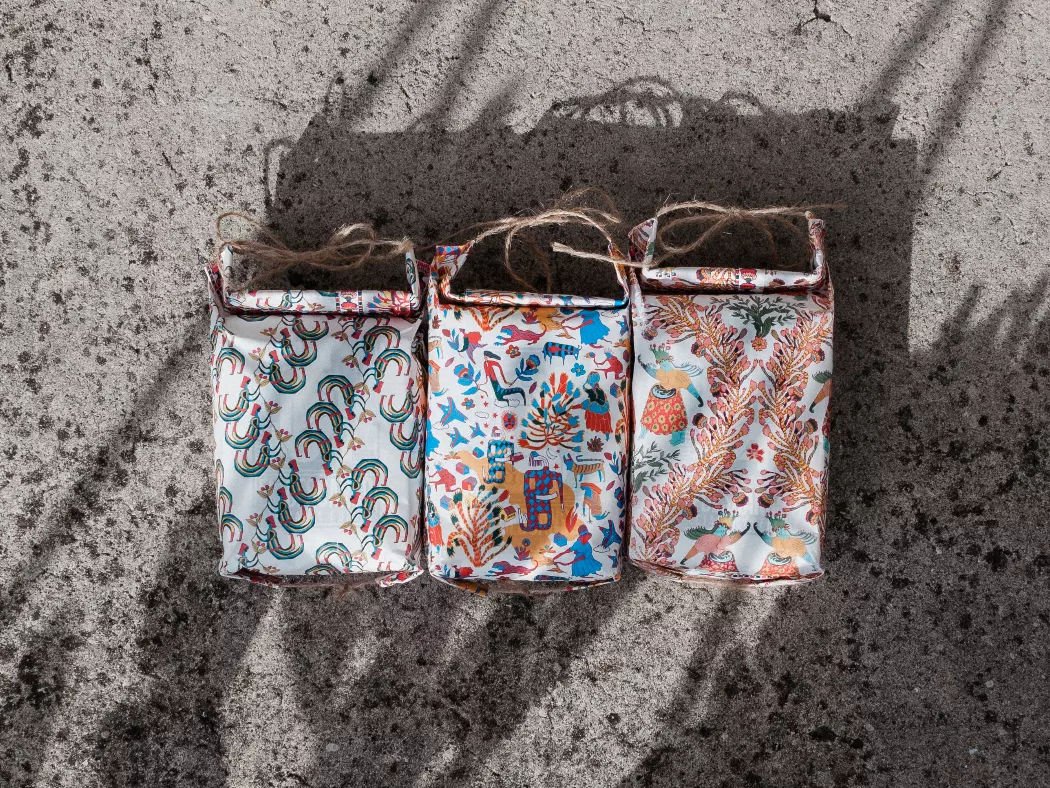
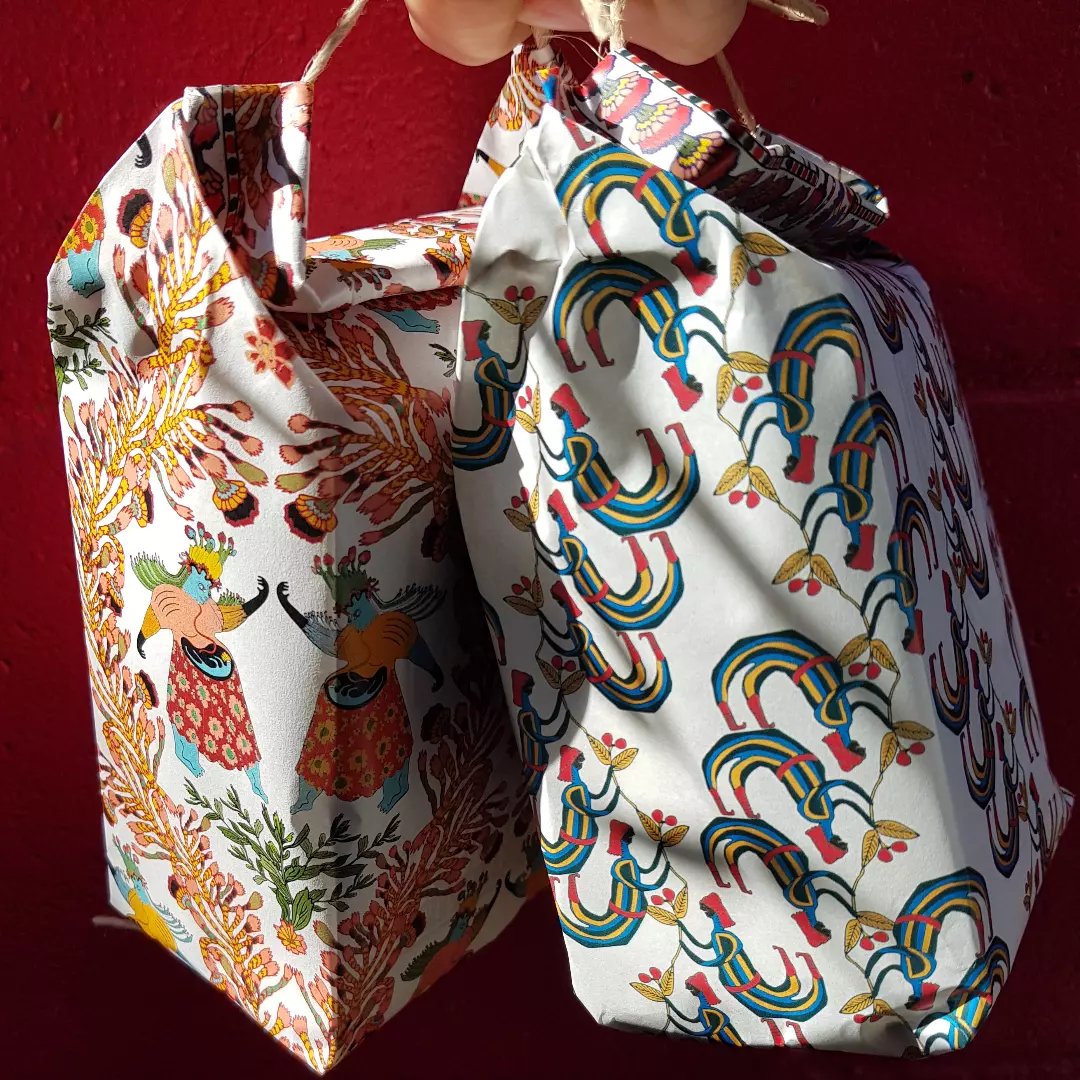
The series took its name from what the research found.
Results
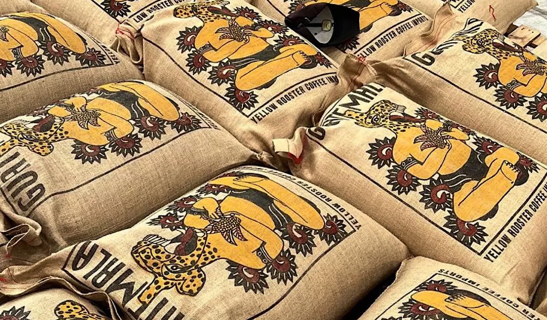
The measure wasn't engagement. It was the conversations the sacks started.
2022–2024 · Specialty Coffee · Cultural & Field Research, Packaging Strategy, Content Strategy · USA
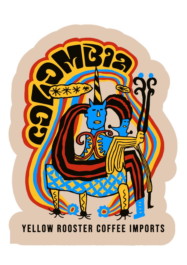
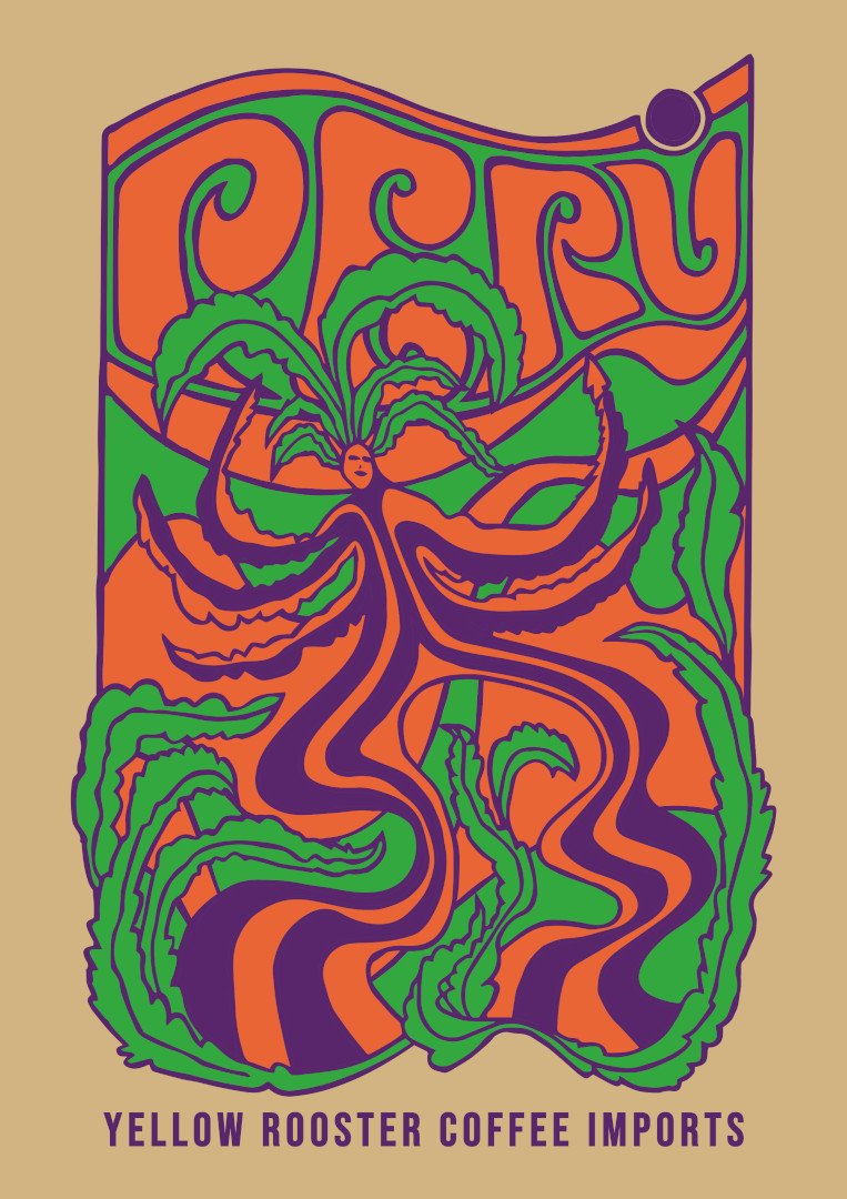
03
Overview
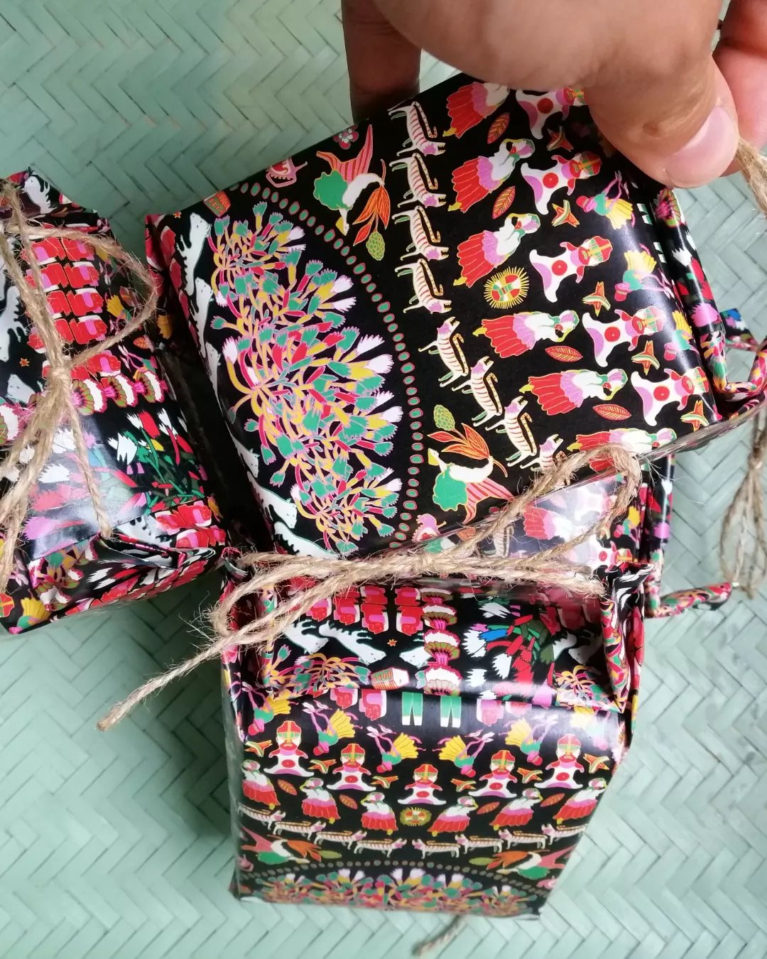
Serie Vol. I had asked what each origin carried.
The Challenge
The challenge was never about making a series.
Approach
The research combined structured interviews with something less deliberate.
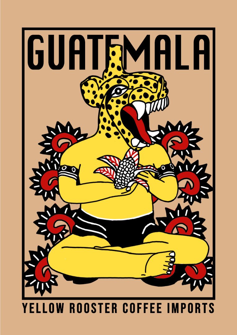
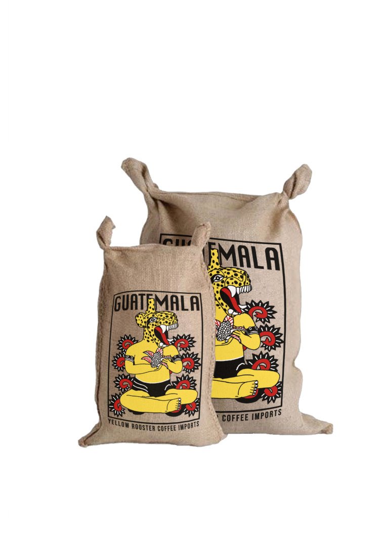
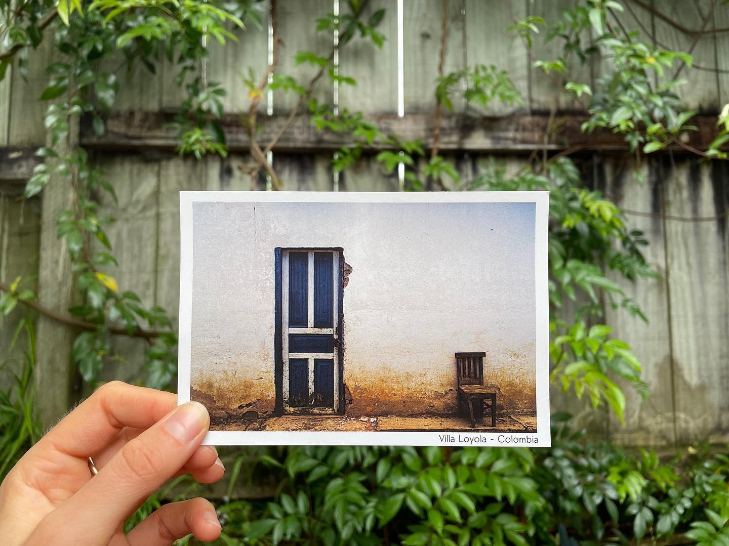
Guatemala
In Guatemala the research arrived at corn before it arrived at coffee.
Colombia
In Colombia the research found what violence couldn't reach.
Peru
Peru's research started with music, not coffee.
Results
Three sacks, three conversations, one pattern that only became visible at the end.
2022–2024 · Specialty Coffee · Cultural & Field Research, Research-Led Creative Direction, Packaging Strategy · USA
04
Overview
The idea came from a photograph.
The Challenge
The New Zealand specialty coffee market had settled into a consensus.
Approach
The market research kept returning to the same absence: nobody was offering rest.
Solution
The chair came first. It went quickly.
The packaging system followed the same logic into product architecture.
Community
Pachamama
Harvest
Experimental
The Series
Community: Multi-producer lots. Exceptional coffees made by many hands.
Pachamama: Comfort-driven coffees. The creative feminine, the nurturing earth.
Harvest: Clean, precise, fine lots organised by the logic of production.
Experimental: Small-batch, curated, shamanic. The rare and the unexpected.
Results
The packaging became the brand's most consistent point of conversation.
2022–2023 · Specialty Coffee · Co-founder, Brand Strategy, Visual Identity, Packaging Architecture, Supply Chain · New Zealand
05
Overview
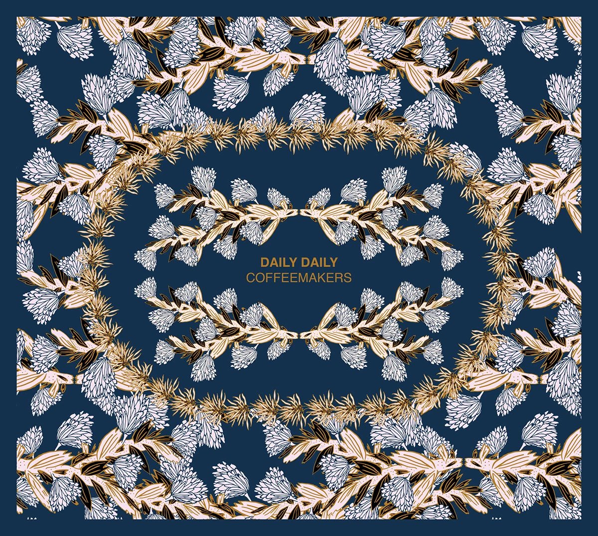
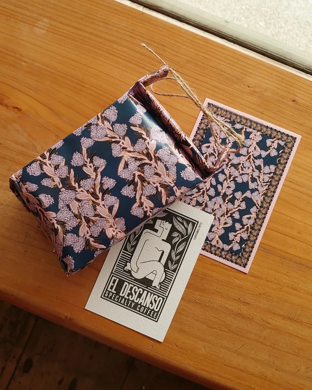
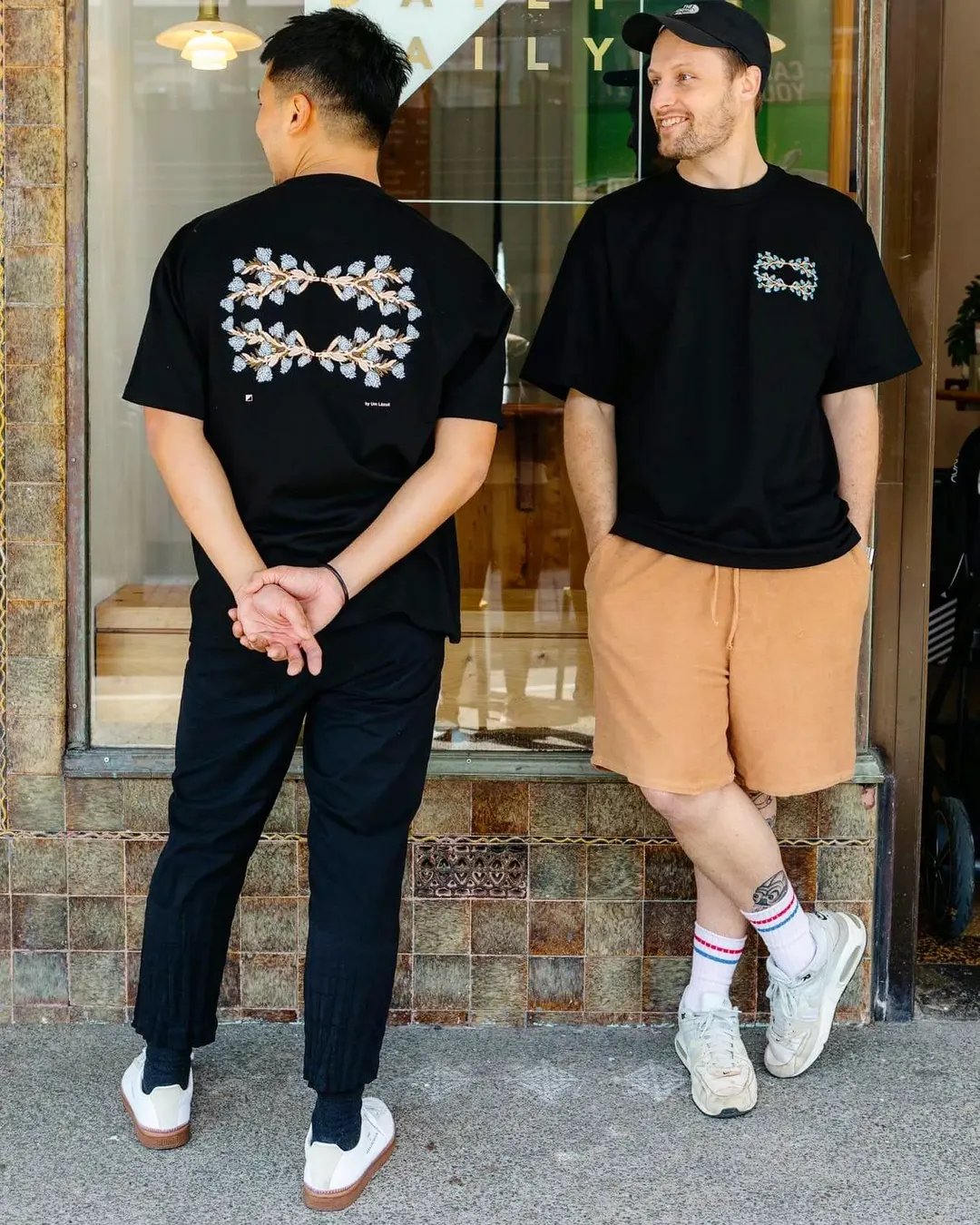
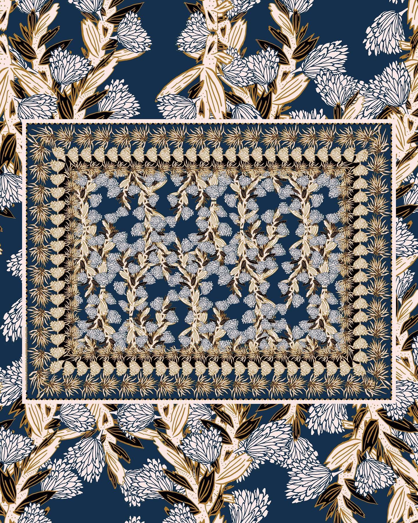
For their fifth anniversary, Daily Daily came to El Descanso looking for a guest roaster.
The Challenge
El Descanso had been built outside the city. Daily Daily was the city.
Approach
One observation organised everything. Daily Daily made the city feel slower.
Solution
The criterion was simple. Coherent with both brands, owned by neither alone.
Results
Daily Daily's community received something designed for them.
2023 · Specialty Coffee · Brand Collaboration, Creative Direction, Limited Edition Identity · New Zealand
06
Overview
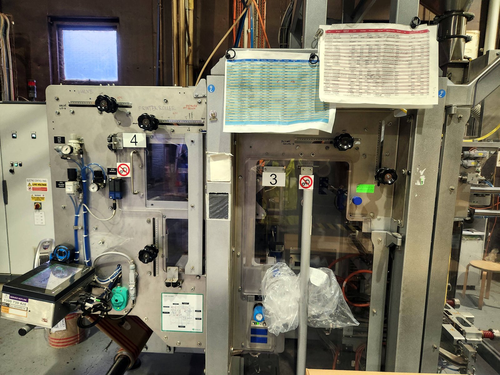
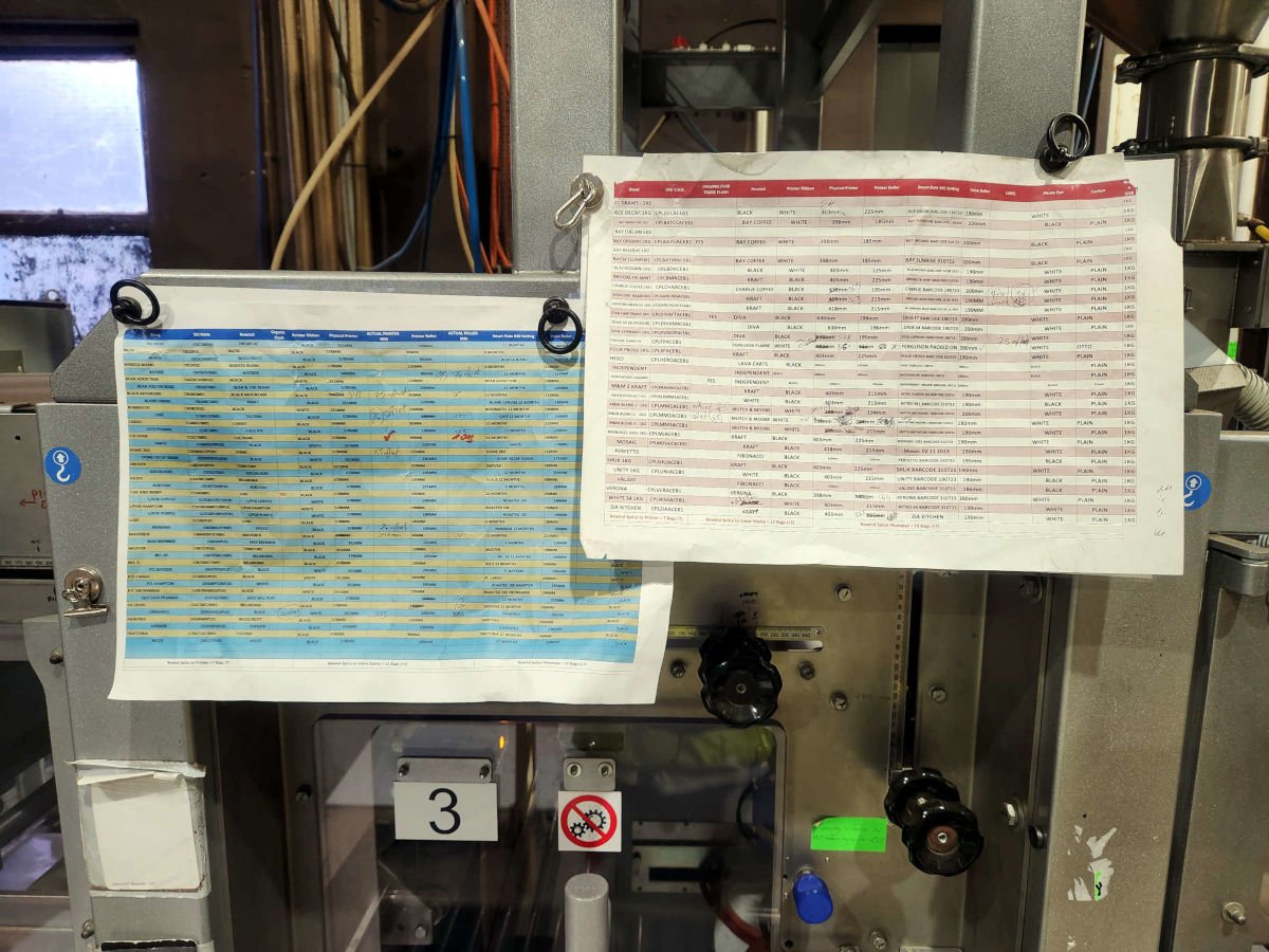
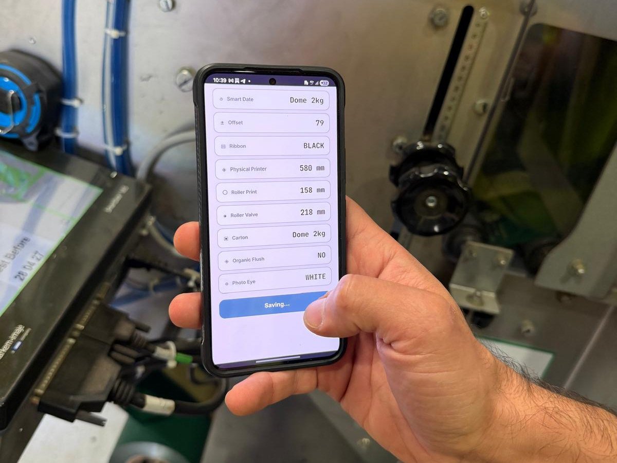
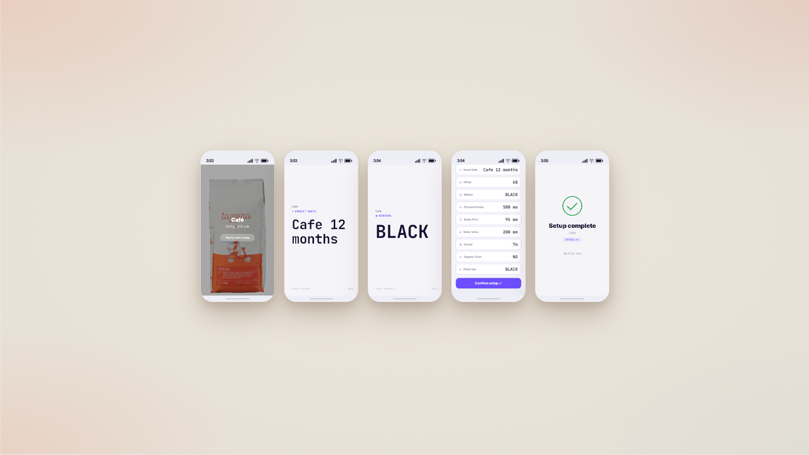
The format was producing the errors. Nobody had looked at the format.
Challenge
The printed sheet asked too much of the operator. Not in volume, but in interpretation.
Approach
Weeks on the floor before a single screen was designed.
Solution
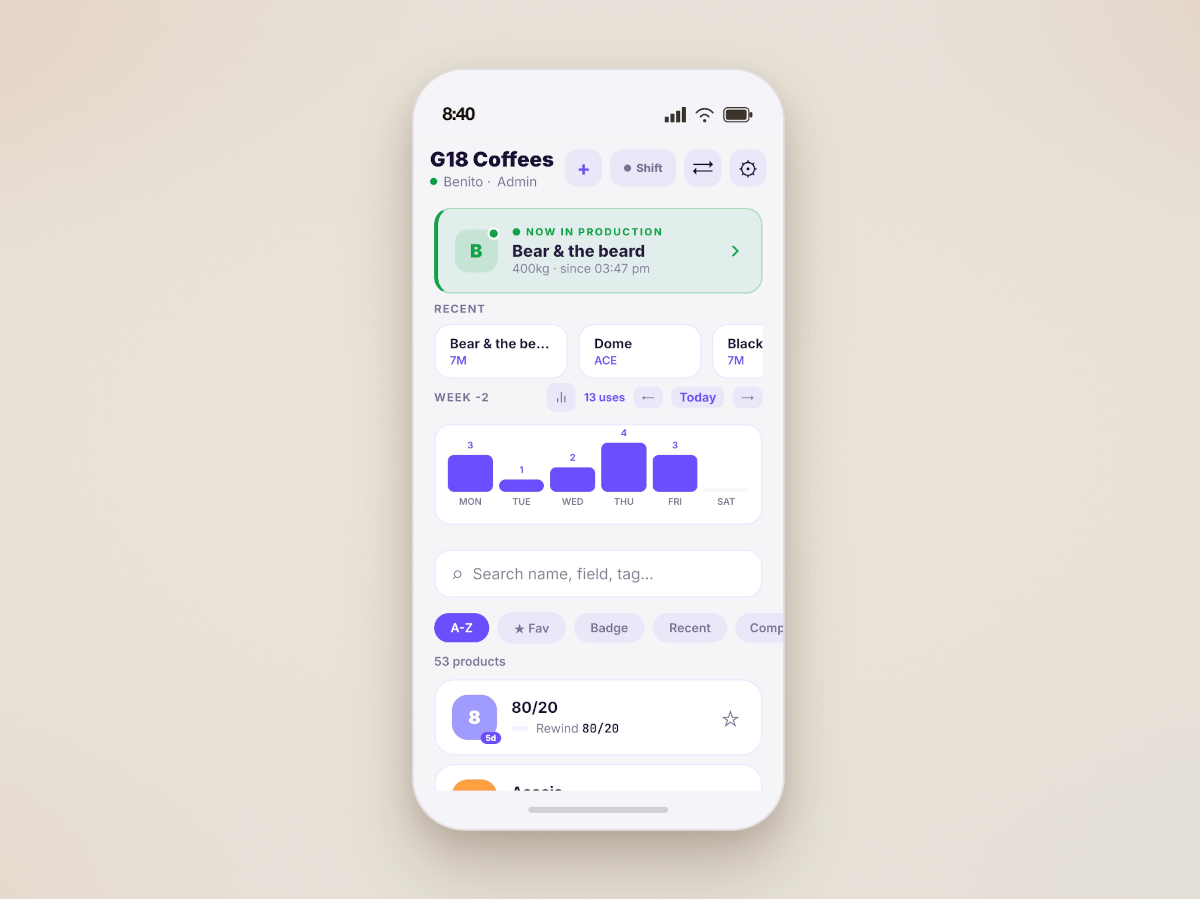
The operator starts the shift with a clear order queue.
Results
Early testing has confirmed what the design assumed, the problem was never the operator.
2026 · FMCG · Operator Centered Research, Format Redesign · Australia
If you're building something worth believing in, let's talk.
hello@ernestodeleonardi.com
Sydney, Australia